MenuNook is a real-time menu platform I built for local food sellers who need a simple way to keep customers updated without managing a full e-commerce store or constantly re-exporting PDFs.
The Problem
Local food sellers often rely on PDFs, Canva exports, Instagram posts, or text messages to show what’s available. That works until prices change, items sell out, or customers need a clean link they can open from anywhere.
Product Approach
MenuNook should feel like the fastest way to go from 0 to online menu, quickly and easily, while also not feeling like a utilitarian tool that just gets the job done.
That meant prioritizing user experience, clarity, simplicity, joy, and a little polish on the menu that would make it felt trustworthy without adding operational weight.
Interactive Walkthrough
From the landing page, users can see a quick demo of the app in action so they can understand the interface and functionality at a glance.
Cookies
3 items
Cookies
3 items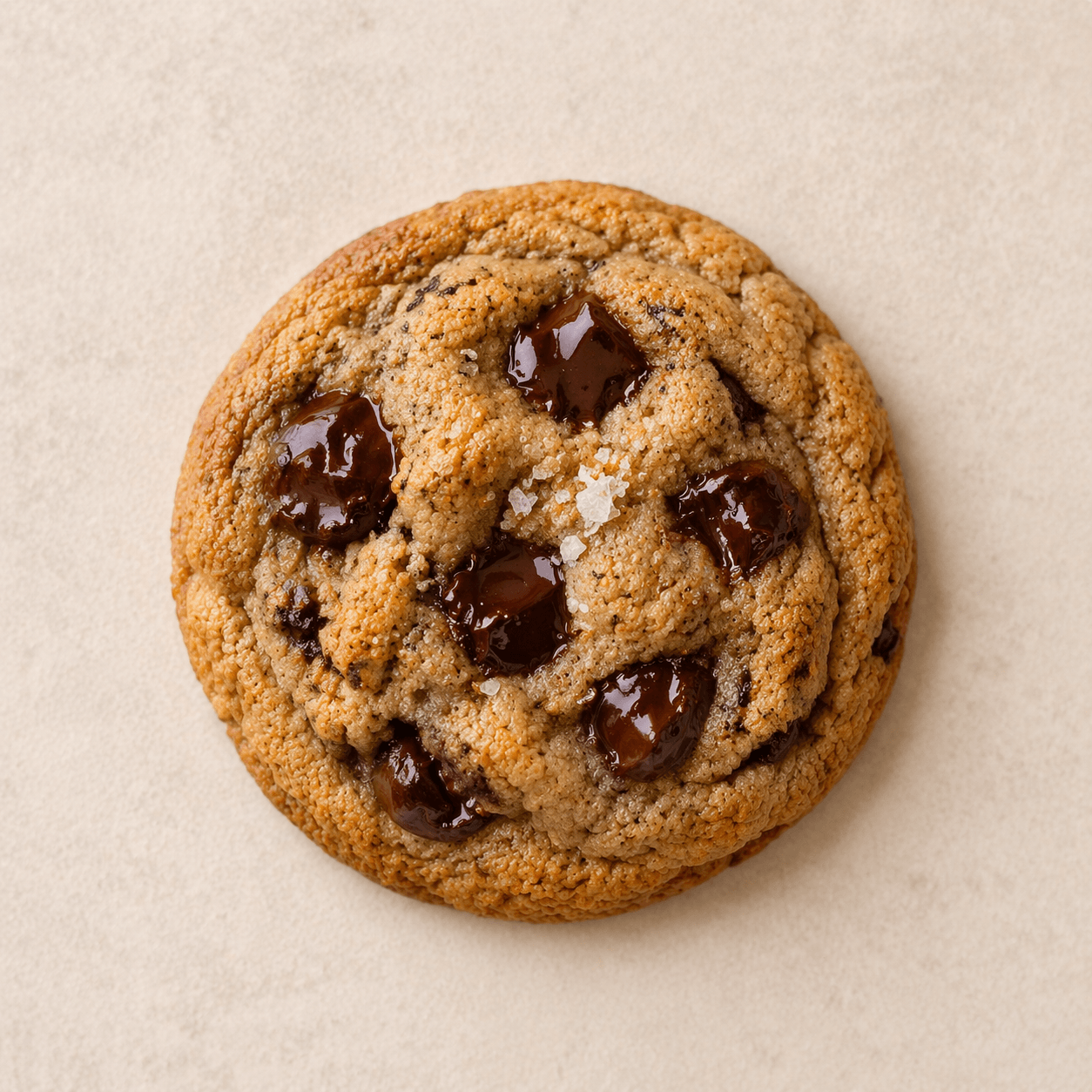
Brown Butter Chocolate Chip
Soft-centered cookies with deep caramel notes and dark chocolate.
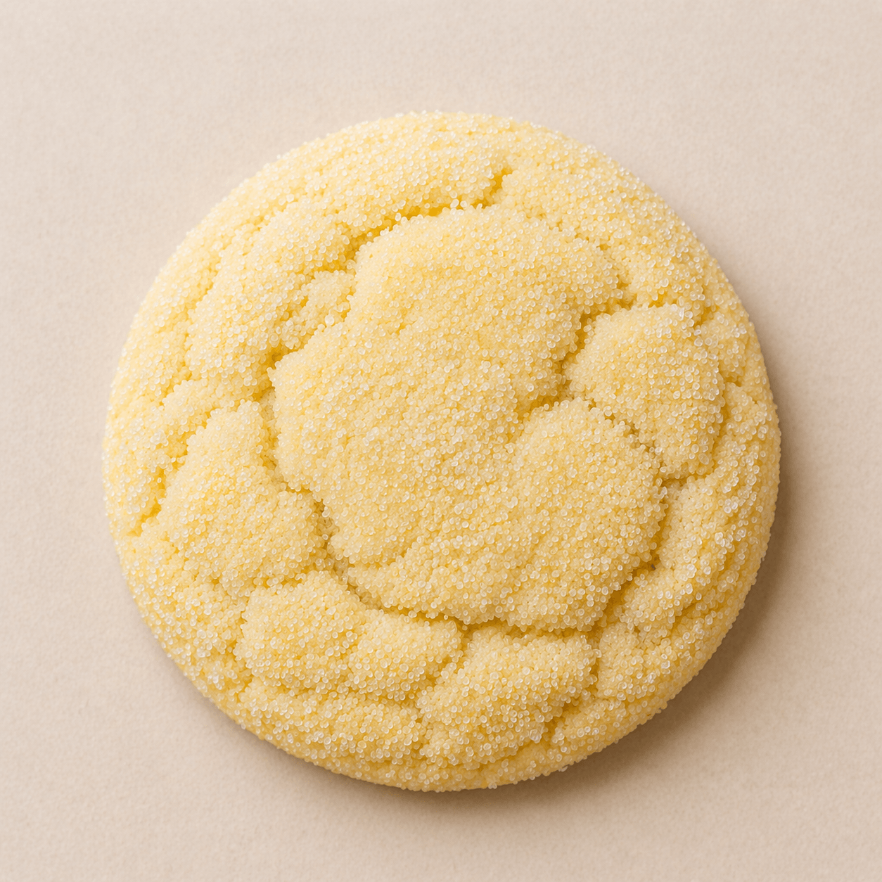
Lemon Sugar
Bright lemon cookies with a sparkling sugar finish.
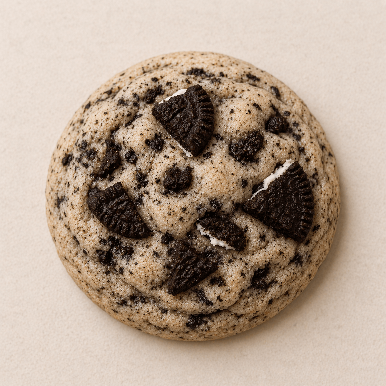
Cookies and Cream
Vanilla cookies folded with crushed sandwich cookies.
Cakes
3 items
Cakes
3 itemsPickup Boxes
3 items
Pickup Boxes
3 itemsMaple Street Bakes
- Cookies
- Cakes
- Pickup Boxes
Small-batch cookies baked fresh for weekly pickups.
Brown Butter Chocolate Chip
Soft-centered cookies with deep caramel notes and dark chocolate.
Lemon Sugar
Bright lemon cookies with a sparkling sugar finish.
Cookies and Cream
Vanilla cookies folded with crushed sandwich cookies.
Celebration cakes and simple rounds for birthdays and gatherings.
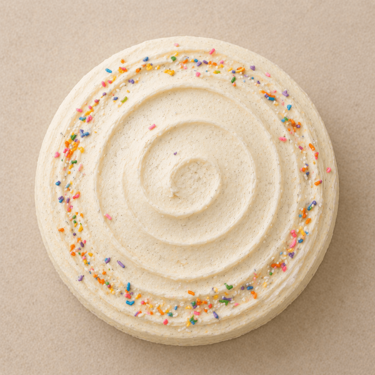
Vanilla Bean Celebration Cake
Sold outA polished layer cake with whipped vanilla frosting.
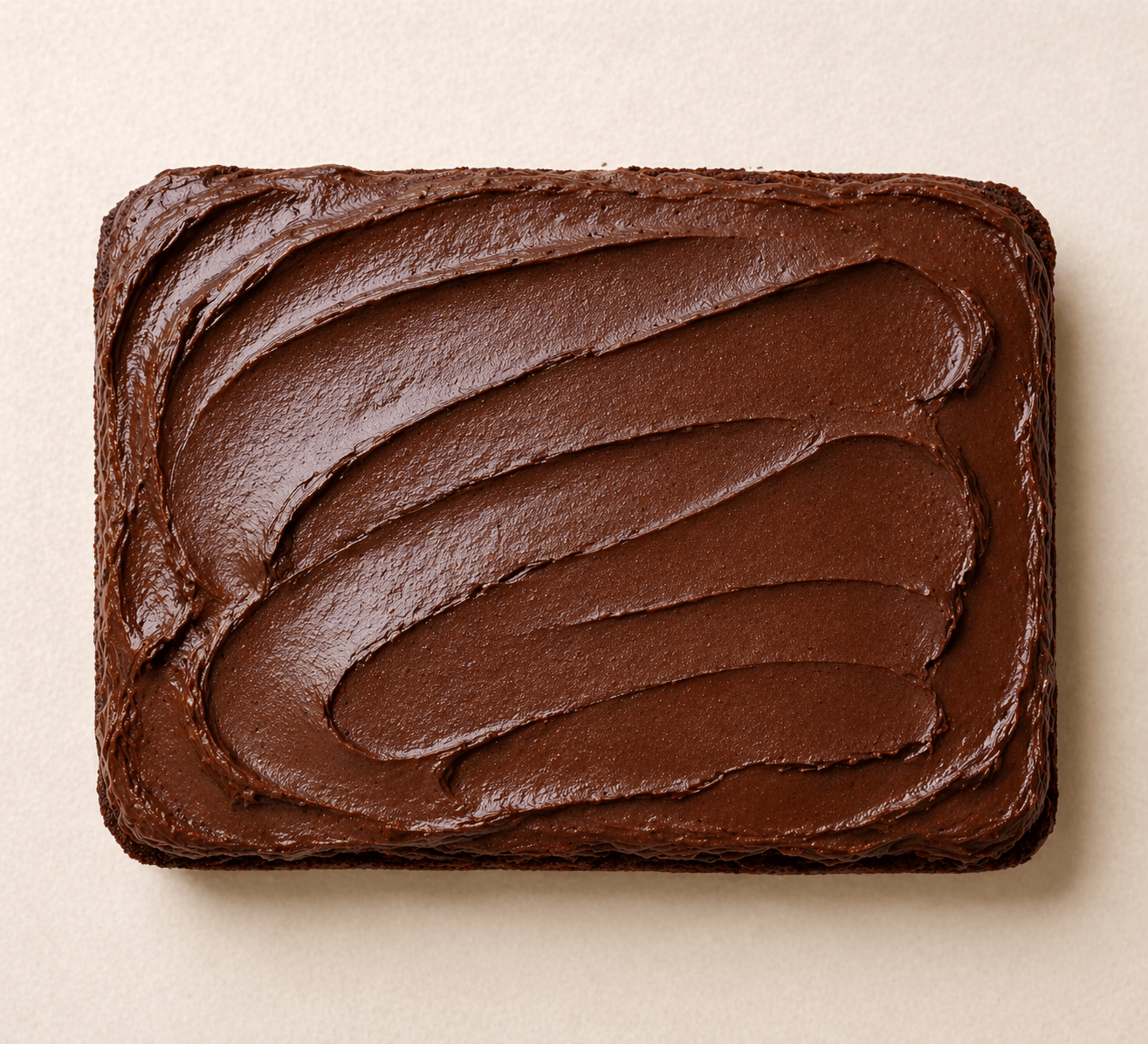
Chocolate Sheet Cake
Rich chocolate cake made for generous, easy slices.
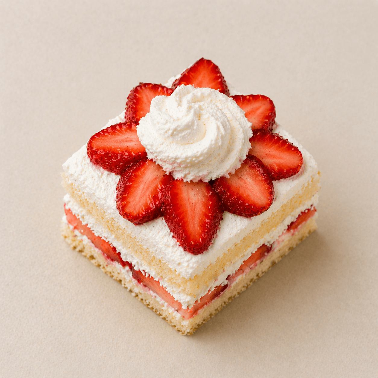
Strawberry Shortcake
Light sponge layered with cream and ripe strawberries.
Ready-to-go assortments for gifting, weekends, and market day.
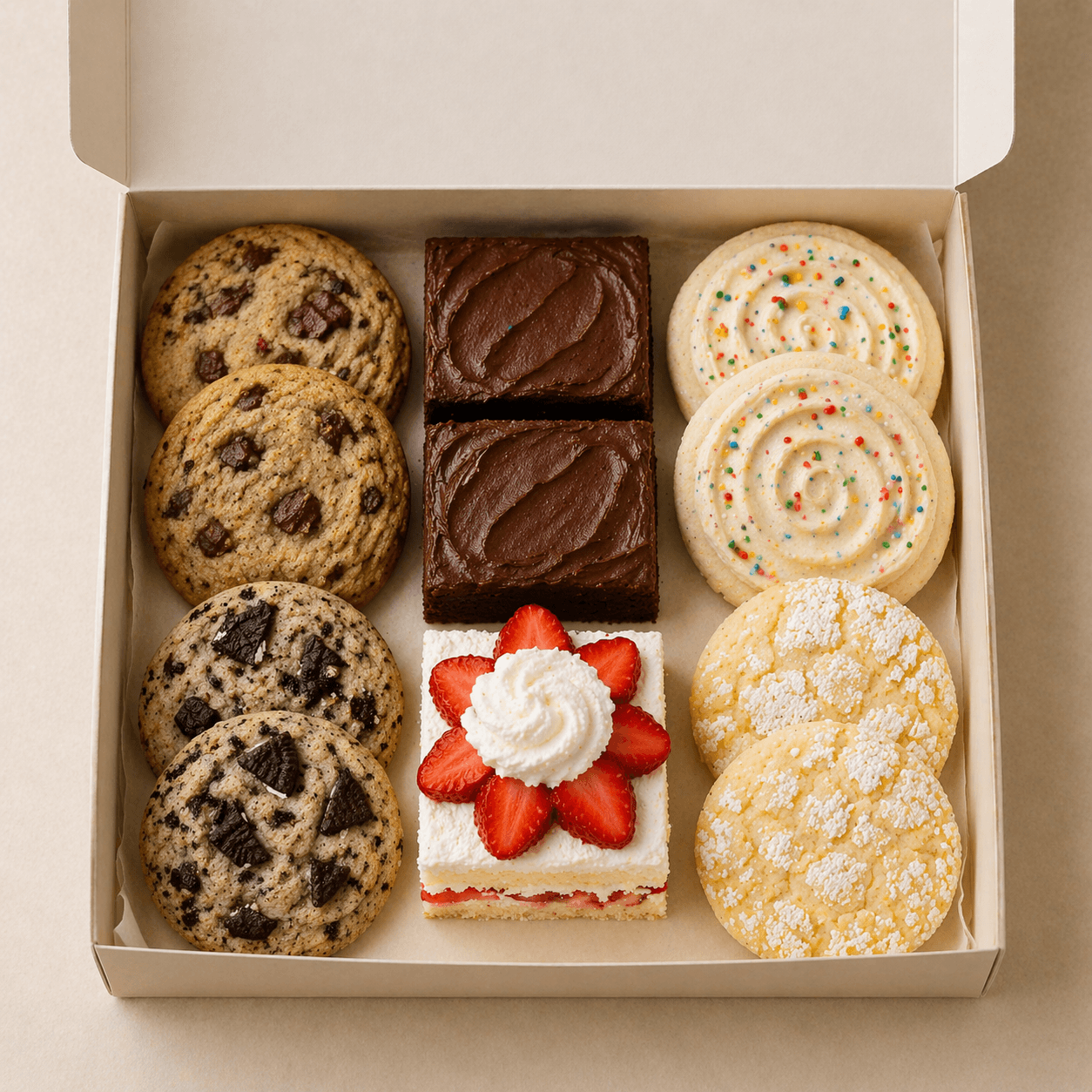
Weekend Treat Box
A rotating box of weekend bakes for porch pickup.
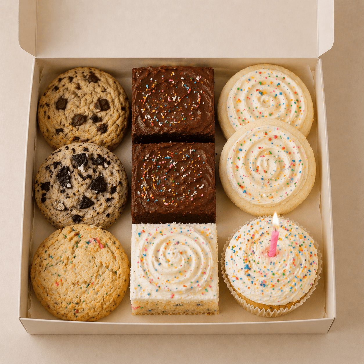
Birthday Dessert Box
Sold outA small-format celebration box with candles included.
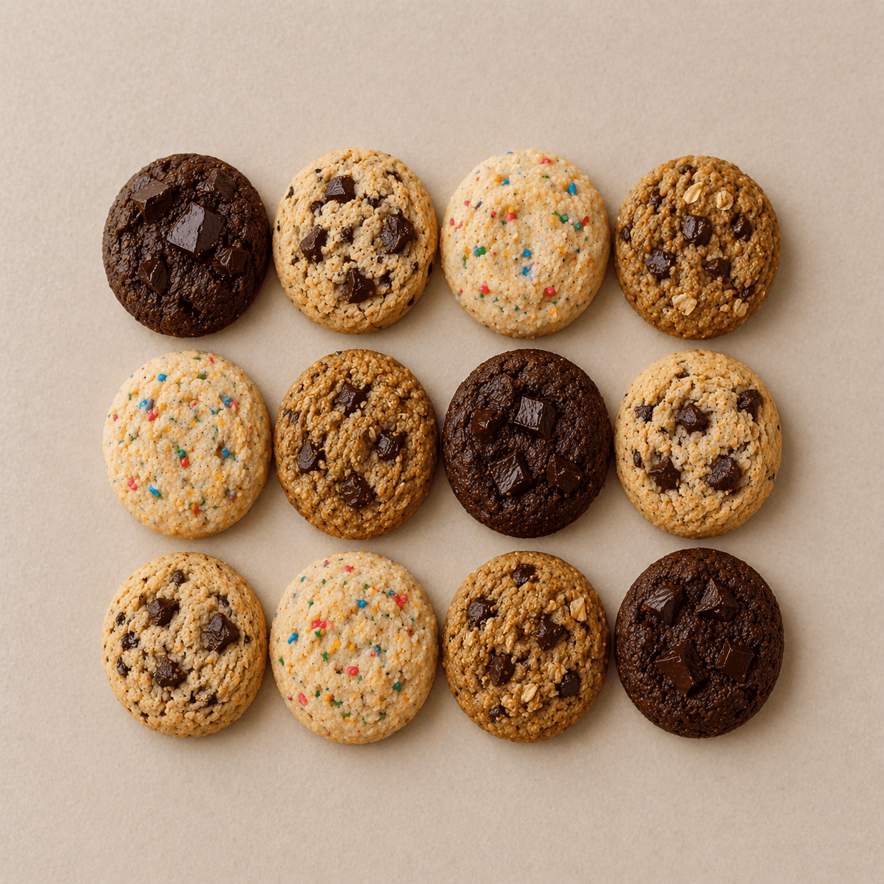
Mini Cookie Sampler
A mixed dozen of mini cookies for gifting or sharing.
When signing in, a quick state-change animation helps users know what’s happening, especially useful if the user has poor internet connectivity.
Once users are signed in, the onboarding process guides them through the essential steps to get their menu up and running.
Get Started
0 of 2
I originally handled setup through a progressive series of forms, but that made the app feel slower and more open-ended than it needed to. Moving setup into a dedicated onboarding flow gave the process a clearer shape, removed unnecessary state-gating fetches from the home screen, and let the main app load into a more focused, ready-feeling experience.
User input shows up across MenuNook in small, focused moments like creating categories, adding items, and editing details, so I wanted each form to feel native to the screen it appears on: a centered dialog on desktop that keeps the current context visible, and a bottom drawer on mobile that is easier to reach, dismiss, and use with one hand.
Responsive dialog and drawer demo
Once categories and items exist, the home screen becomes the main editing surface.
I wanted ordering to feel direct instead of hidden in a settings screen, so both category cards and item rows can be moved in place.
Cookies
3 items
Cookies
3 itemsBrown Butter Chocolate Chip
Soft-centered cookies with deep caramel notes and dark chocolate.
Lemon Sugar
Bright lemon cookies with a sparkling sugar finish.
Cookies and Cream
Vanilla cookies folded with crushed sandwich cookies.
Cakes
3 items
Cakes
3 itemsPickup Boxes
3 items
Pickup Boxes
3 itemsThe Result
I built MenuNook as a focused publishing tool for local food sellers: create a business profile, add categories and items, reorder the menu directly, update details as things change, and share one live link customers can trust.
Most of the work went into removing the friction that usually makes small tools feel heavier than the problem they solve. I replaced a slower progressive setup with guided onboarding, kept editing on the main surface, made dialogs responsive across desktop and mobile, added drag-and-drop ordering, and used small state transitions to make network-dependent moments feel legible.
The finished product is a calm control panel for keeping a public menu current, readable, and ready to send whenever a customer asks what’s available.
One live menu, easy to update, always ready to share.