MenuNook
Building a simpler menu experience for local food sellers.
Local food sellers often rely on PDFs to share their menu because they’re easy to make and easy to send. But once updates become frequent, that convenience starts to wear off.
Every price change, sold-out item, or seasonal addition means editing the file, exporting it again, and making sure the newest version is the one people actually see.
Many of these sellers don’t need the overhead of a full website or ecommerce system to begin with, especially when orders are still handled manually and payment is often collected in cash.
With MenuNook, I wanted to build something simpler.
Not a full storefront. Not a heavy system to maintain.
Just a clear, easy-to-update menu experience that felt fast, useful, and good enough to stand in for a website for people who don’t really need one.
Making the product feel simple before anyone uses it
Since the product is meant to reduce overhead, I wanted to make sure the website felt light and approachable.
It needed to explain the value quickly, make the right person feel seen, and avoid sounding like yet another bloated platform pretending to be simple.
That led me toward language that felt immediate and practical, not polished and abstract.
I landed on “Show What You’re Selling Today” because it stays close to the actual job: helping someone present what is available right now, without rebuilding a page or resending a PDF every time something changes.
The supporting should make it abundantly clear what MenuNook is and who it’s for.
I went with “A simple live menu for local sellers who don’t need a full website or online checkout” to narrow the audience and set the scope.
And I used “No PDF updates. No store setup. Just one clean link you can share and update anytime.” to make the payoff more immediate.
Giving them something they can feel
Since MenuNook is all about making menus feel clearer, faster, and easier to engage with, it felt important to let visitors experience some of that before they ever signed up.
So instead of treating that section like a static mockup, I put an interactive menu (the type their customers would see) on the landing page for them to play with.
Maple Street Bakes
- Cookies
- Cakes
- Pickup Boxes
Small-batch cookies baked fresh for weekly pickups.
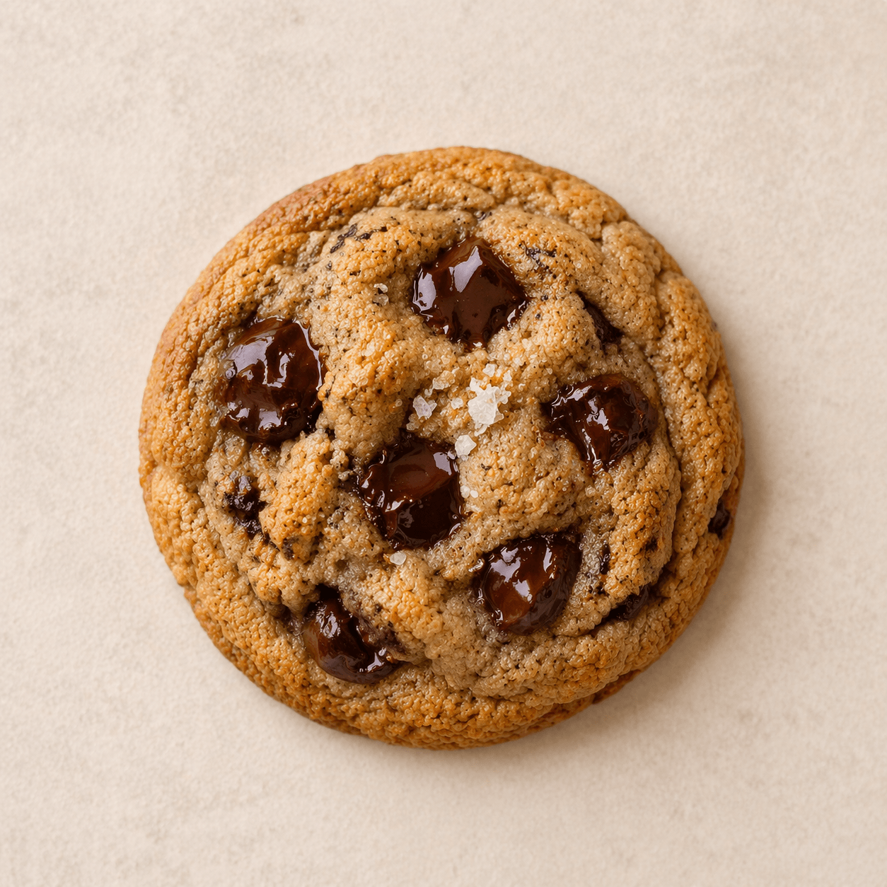
Brown Butter Chocolate Chip
Best sellerSoft-centered cookies with deep caramel notes and dark chocolate.
View details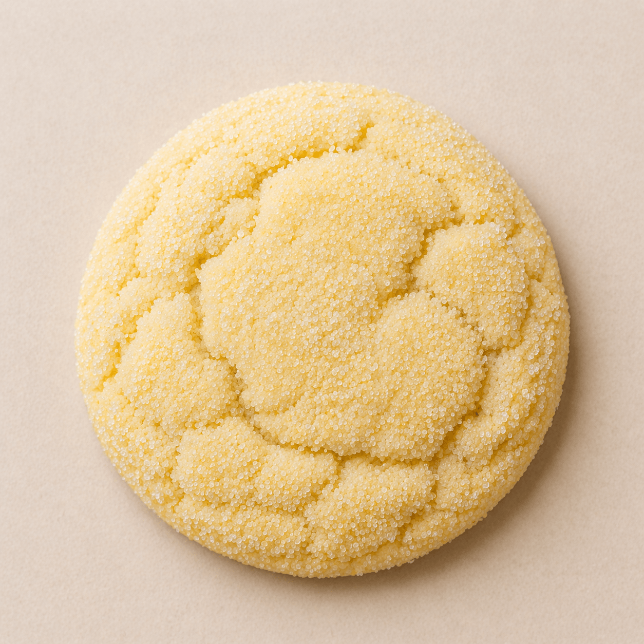
Lemon Sugar
Bright lemon cookies with a sparkling sugar finish.
View details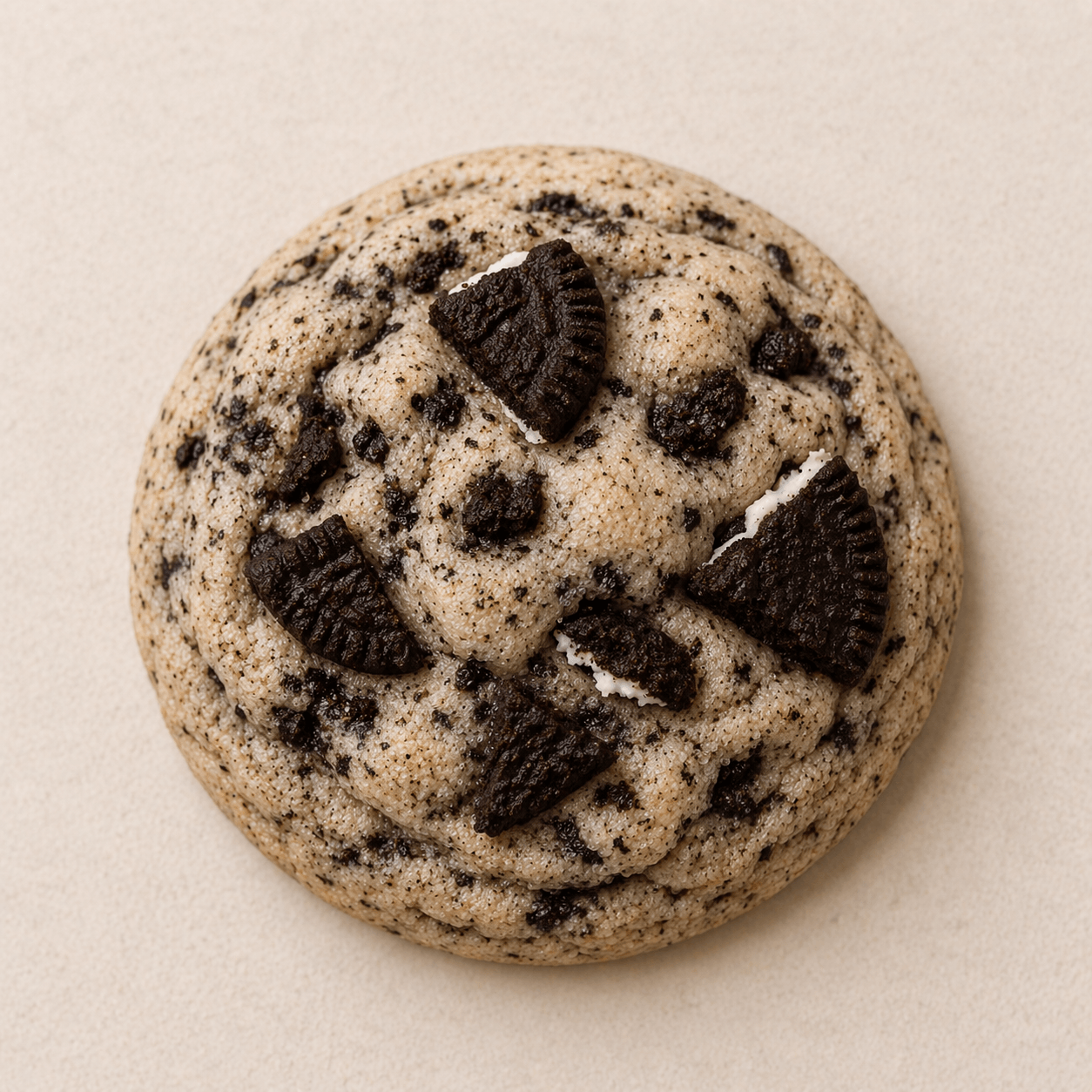
Cookies and Cream
This weekendVanilla cookies folded with crushed sandwich cookies.
View detailsCelebration cakes and simple rounds for birthdays and gatherings.
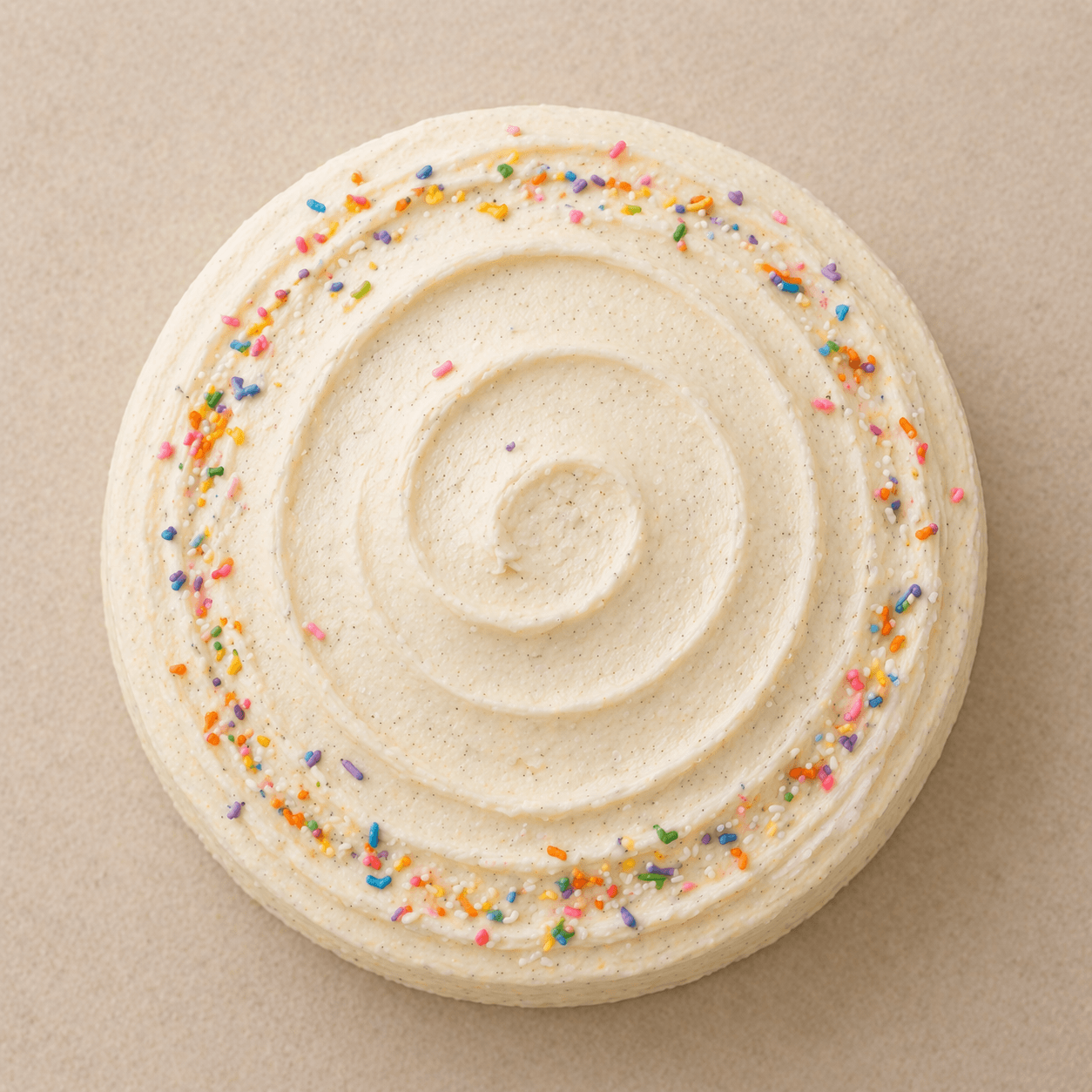
Vanilla Bean Celebration Cake
A polished layer cake with whipped vanilla frosting.
View details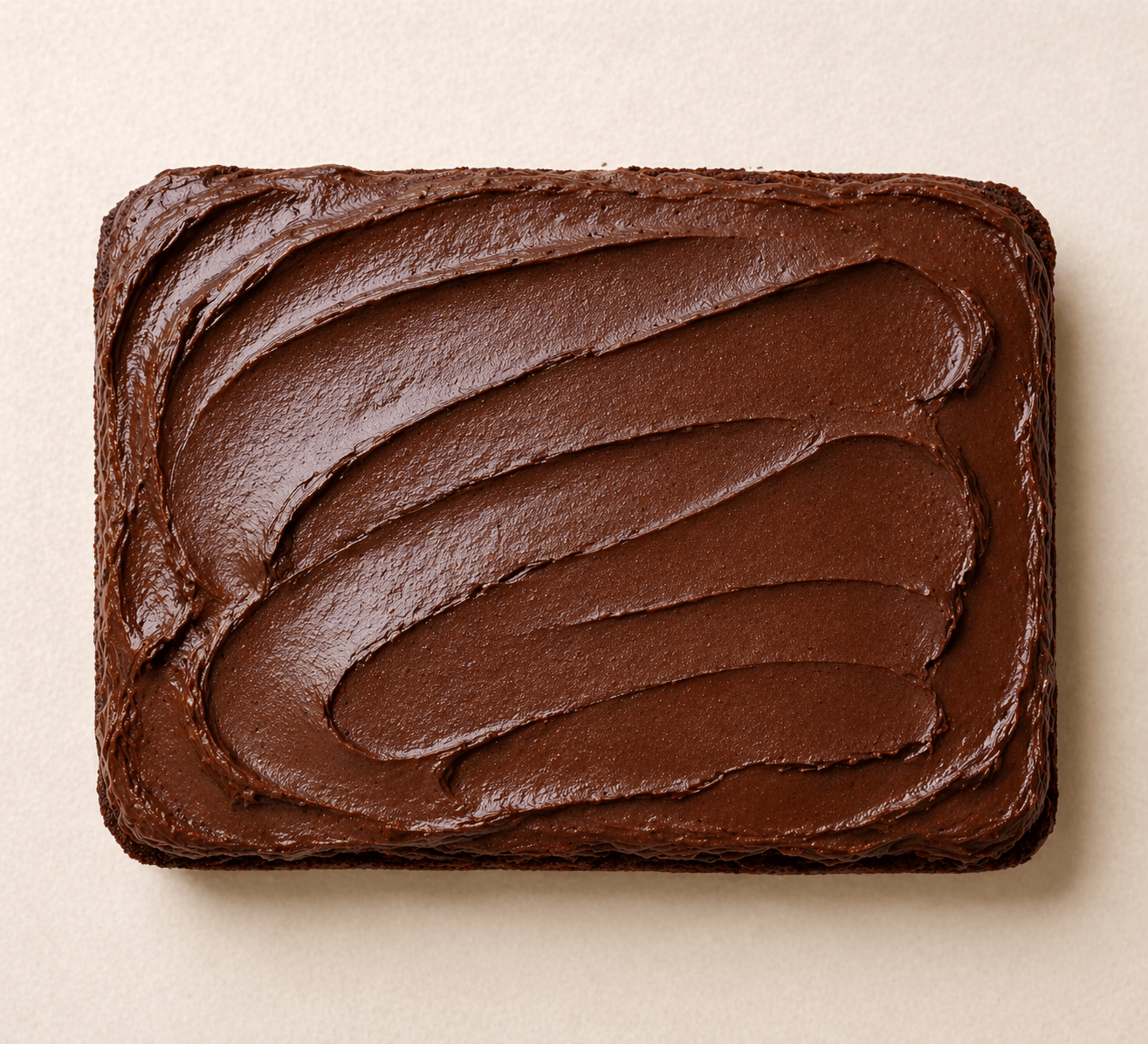
Chocolate Sheet Cake
PreorderRich chocolate cake made for generous, easy slices.
View details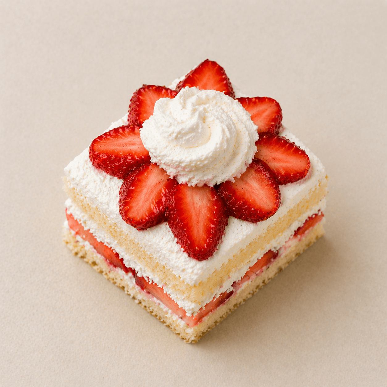
Strawberry Shortcake
Limited datesLight sponge layered with cream and ripe strawberries.
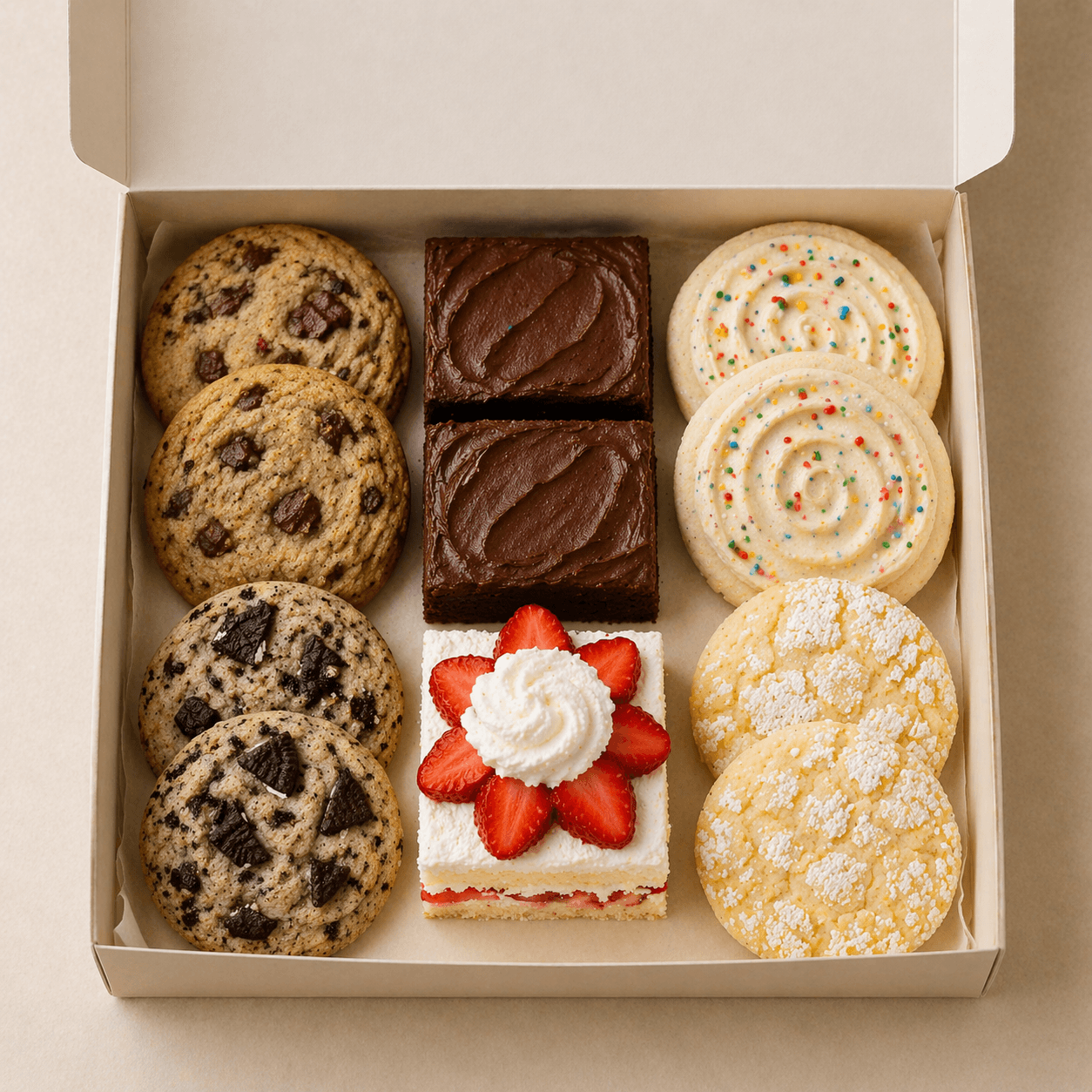
View detailsReady-to-go assortments for gifting, weekends, and market day.
Weekend Treat Box
A rotating box of weekend bakes for porch pickup.
View details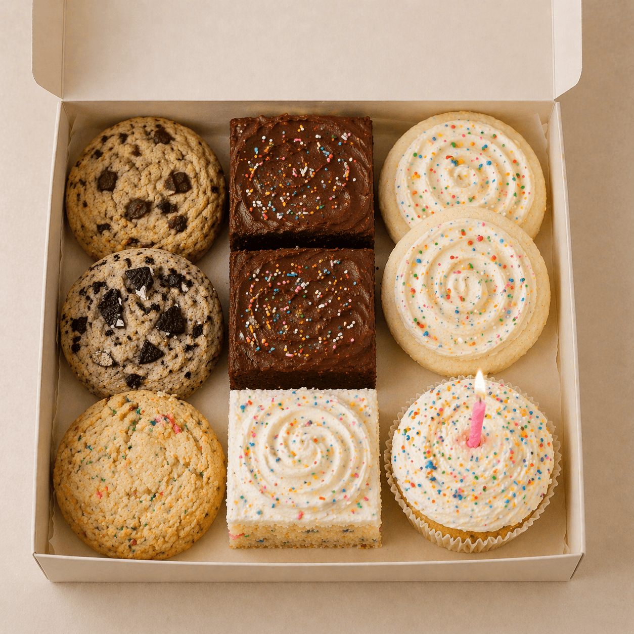
Birthday Dessert Box
Out of stockA small-format celebration box with candles included.
View details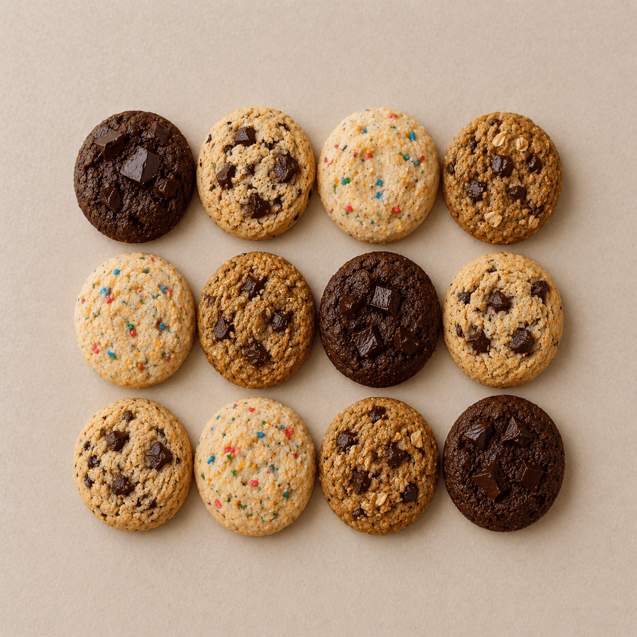
Mini Cookie Sampler
Pickup FridayA mixed dozen of mini cookies for gifting or sharing.
View detailsThat kind of detail matters to me. Small touches like this can improve conversion, but they also reflect a level of care that I think matters more now than ever before.
AI makes it easy to generate things quickly and at scale, which means it is easier than ever to just stop at “good enough.”
But from my perspective, what stands out more now is not just the presence of something, but the intention behind how it was made.
Making the app feel as simple as the pitch
I didn’t want the seller experience to feel like building pages. Instead of treating someone like a site manager, I treated them more like someone maintaining a live list of what is available right now.
That’s why the core workflow revolves around categories and items. The structure is simple: group what you sell, order it the way you want people to scan it, and make small updates as things change.
The seller isn’t trying to design an information architecture every week. They’re probably just trying to keep customers from seeing the wrong thing.
That same thinking shaped the editing surface. Each item has just enough room to be useful: a name, a short tagline, a description, an image, and a few supporting details when they actually help. I capped it here to make something feel clear and worth buying, without forcing someone to write a miniature sales page for every item.
It also carried over to the public menu. If a category does not have any items in it yet, it stays out of the customer-facing experience.
That may sound small, but I think rules like that matter. A clean experience is often less about what you add and more about what you refuse to show before it is ready.
Designing for upkeep, not just setup
A lot of software feels manageable when you first set it up. The real test is what it feels like a week later, when you need to update one thing quickly and move on with your day.
Can someone update an item, adjust the order, swap an image, preview the result, and get back to making?
That felt like a more useful question than whether the app could support every possible configuration. A lot of the product decisions were really decisions about reducing maintenance friction.
Categories can be reordered. Items inside a category can be reordered too.
- Cookies
Small-batch cookies baked fresh for weekly pickups.
- Cakes
Celebration cakes and simple rounds for birthdays and gatherings.
- Pickup Boxes
Ready-to-go assortments for gifting, weekends, and market day.
The preview stays close to what customers will actually see, so there is less guesswork between editing and publishing. And the menu gives the seller one stable thing to share, instead of creating another versioned file they have to keep resending.
Maple Street Bakes
Weekend Pickup Menu
Cookies
Small-batch cookies baked fresh for weekly pickups.
Brown Butter Chocolate Chip
$18.00Soft-centered cookies with deep caramel notes and dark chocolate.
Lemon Sugar
$16.00Bright lemon cookies with a sparkling sugar finish.
Cookies and Cream
$18.00Vanilla cookies folded with crushed sandwich cookies.
Cakes
Celebration cakes and simple rounds for birthdays and gatherings.
Vanilla Bean Celebration Cake
$58.00A polished layer cake with whipped vanilla frosting.
Chocolate Sheet Cake
$42.00Rich chocolate cake made for generous, easy slices.
Strawberry Shortcake
$60.00Light sponge layered with cream and ripe strawberries.
Pickup Boxes
Ready-to-go assortments for gifting, weekends, and market day.
Weekend Treat Box
$24.00A rotating box of weekend bakes for porch pickup.
Birthday Dessert Box
$28.00A small-format celebration box with candles included.
Mini Cookie Sampler
$14.00A mixed dozen of mini cookies for gifting or sharing.
I like this balance because it helps both sides just get what they need. The seller can keep the menu accurate with ease and the customer can get not just a great initial view, but also deeper details if available via the dialog.
That is probably the clearest expression of what I wanted MenuNook to be: not a full commerce platform, not a website builder, and not a dressed-up PDF, but a lightweight system for the specific job of keeping a live menu clear, current, and easy to share.
If you’d like to check it out, you can visit the website or take a look at the source code.